Monday 30 September 2013

Skyscrapers in New York - A viz for my new home, and a blog entry for Tableau Public Design Month

This blog entry is a rather special one for me because I have been asked by the good folks at Tableau Public to say something about the way I design my vizes. I was very flattered to be asked to contribute.

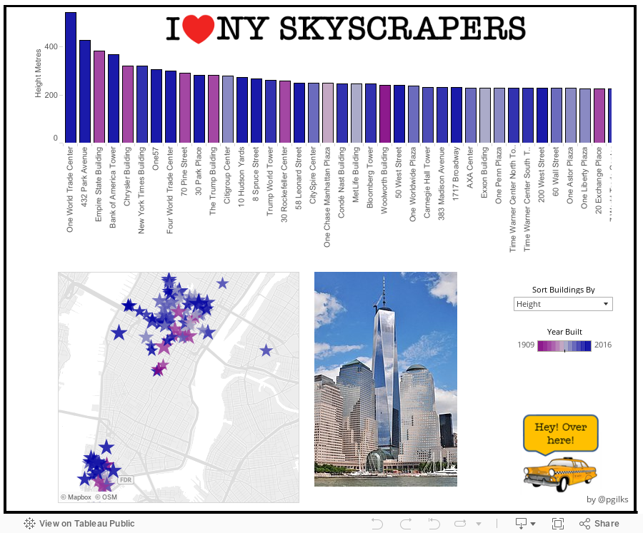
Below is my new viz showing the tallest buildings in New York. I moved from London to New York just over two months ago, and I love it here so I wanted to do a NYC themed viz in honour of my new home. I also happen to be someone who has always been fascinated with tall buildings, so this seemed like a natural choice of subject. So first up here's the viz, I hope you enjoy exploring the virtual New York, and below it are some of my thoughts around design in Tableau and the key elements that make up this viz.


5 Key building blocks in the design of this viz:

1. Giving the viz a New York feel:
I wanted to make this viz obviously about New York City, so that even if all text were obscured you would be able to instantly recognise that NYC is the theme. I did this with two devices. The first is the title which riffs on the famous 'I (heart) NY' logo seen gracing the t-shirts of tourists throughout the city.
To make this I found out the name of the font used in that famous logo - American Typewriter - and found myself a free source to download the font. I often use an open source website called DAFONT, but this time I had to look elsewhere. I then simply copied and pasted the heart from the web using a screen grab and put the title together in Powerpoint before saving as a PNG file. Tableau does not work too well with custom fonts when published so its important to save the title as a picture and bring it in as an image.


The second device for implementing the look and feel is the yellow taxi. Again I copied an open source image from the web and this time added a speech bubble in Powerpoint, again using American Typewriter font before saving as a PNG file. I then brought the taxi into the dashboard by placing it as a shape in a worksheet. I did this so that I could use the taxi as an icon to hover over for more info, which is a tip I picked up at the Tableau Customer Conference.


You don't have to go over the top with clutter to give a viz a theme.

2. Creating a good tooltip
Spending just a little time working on your tooltips is a very easy way to give your viz a look that is unique and not just based on default settings. First up I always turn off the command buttons, I really hate those things. Then I add in as much dynamic info as is useful and try to construct the tooltip in an engaging way. Sometimes I write sentences but I felt in this instance mixing in a more modular approach worked best to get the various stats across. And I wanted to link in something with the taxi. Here's how I made it:


3. Getting photos of each building

This was a very important step as I thought it would be silly to do a whole viz about skyscrapers but then not show what they look like. I brought in the photos using a floating web box in the dashboard and linked each one to a URL I captured from the web and brought into the datasource. Unfortunately each URL I grabbed was a completely different size, so I ended up spending a lot of time resizing the photos. This wasn't too bad as most of the photos came from wikipedia and you can change the pixel width of the picture within the URL itself. However it was a pain in the butt getting each one right and sourcing the missing pictures.
I had wanted to use a picture frame to sit behind the photos but the different aspect ratios of the pictures meant it looked a bit rubbish so I scrapped the idea.

Here's some examples of photo url's before and after resizing. See if you can spot the difference.


4. Using a parameter to view the data in two different ways

Something I do quite a lot is use parameters in Tableau to enable the end-user with the option of viewing the data in a couple of different ways. In this case I let the user pick between viewing the bar chart of buildings sorted by descending height, or descending age. I thought the latter view in particular would provide some insight into the two great ages for New York skyscrapers, which are right now and the 1930's.
This is what the parameter looks like and also the calculated field that runs from it to enable the sorting.


I also spotted something interesting about the data, which was that there were no skyscrapers built between 1934 and 1959, so I decided to call that out using a text box that would only appear when the view was sorted by Year Built. Here's what that calculated field looks like:

5. Going the extra mile to get the final bits of data

I sourced the main data for this viz straight from wikipedia. In fact I do that a lot on Tableau Public. I like to take info that's already out there and try to present it in a more engaging form. However the wikipedia entries did not include a latitude and longitude and I felt a map of Manhattan was pretty essential to doing this viz right. So I had to get onto Google maps, locate the buildings and use the 'what's here' function you get when right clicking on the map to bring up the latitude and longitude. A few copy and pastes later and I had what I needed for the map.

I also decided to add in the cross-streets rather than the simple street address given in wikipedia. This is because no one can really visualise where say 320 5th Avenue is, but if I say a building is at 42nd and 8th then its easy to visualise. Also this tied in nicely with the taxi theme.

Sometimes unfortunately the data you want isn't all there in the first place you look and some manual work is involved to get the last little bits that really make the viz look complete.

Finishing touches and other thoughts

I've no idea why I used the colours I did, other than trial and error until it 'popped'. I definitely though wanted the background for this to be white as I wanted it to look clean. I also built in a few little things to make the viz neater, like the border and colour legend.

One of the things I also learnt at TCC13 was to use hovering actions instead of select actions to make it more obvious to the user that the viz is interactive and to help them dive right in to using that interactivity. I pick up a lot of tips and tricks from studying the work of other Tableau bloggers, and I know others do too. I think that attitude is helping drive up quality across the board.

One final thought on design that I picked up from my wife is a quote from Coco Chanel: "When accessorizing, always take off the last thing you put on". I did that here and I'm glad I did.".


Sunday 15 September 2013

My Tableau Customer Conference Takeaways

This is going to be an unusual blog post for me, as it's not going to contain a single image or Viz. I just thought I'd use the opportunity to collect my thoughts on the recent Tableau Customer Conference in DC, so here we go in no particular order:

1. The Tableau user community is way, way bigger than you think. There are a hardcore group of Tableauites I follow on the web, and when you are part of that kind of 'super fan' community its easy to think that's what its all about. But at TCC you find you couldn't be more wrong. There were about 3.5k attendees, and many of them probably rarely read data viz blogs or follow every move on Twitter. And at the end of the day those folks are the reason Tableau exist, i.e. to service business users and not just the geeks like me who also do data analysis 'for fun' when they get home.

Maybe half the attendees I met, and half the Tableau employees, had either been using or working with Tableau for less than a year. A strong sign of growth if nothing else, but it does make me wonder how Tableau will develop as the user base widens. Can they stay true to the vision without dilution while still growing so quickly?

2. TCC is exhausting! It only lasts 3 days but TCC can really knock you for six. I think holding the (very cool) party after only one full day probably doesn't help, but also all the running around to sessions can make you feel rather drowsy. I can't have been the only one who missed a midday keynote to sneak in a quick nap....

3. When deciding on what talks to go to, choose people over topics. Tom Brown from The Information Lab told me this last year, and I followed his advice a little, but not enough. For example, I have little personal or career interest in understanding how hospitals are run -  not that its not potentially interesting, but you know, only so many hours in the day - but 'Improving Hospital Quality of Care with Data Blending' was one of the best talks I attended because the speaker Jonathan Drummey is basically a Tableau genius. Check his website out http://drawingwithnumbers.artisart.org/ (it is by the way a complete coincidence that I gave my blog a similar title, honestly!).

Then I made a very big mistake and went against my own advice. Instead of going to hear Anya A'Hearn http://datablick.com/ I went instead to something about how Tableau is made, based upon the title alone 'How we build Tableau - a Peek behind the Curtain'. Really interesting title I thought, I will get to see all the stuff behind the scenes. Nope. Just some talk about Agile and Scrum and other project management stuff I have no idea about. I'm sure it was a good talk for people into that, just not for me. Anya, I made a big mistake, I'm sorry, but thank you for making your slides available to everyone http://datablick.com/2013/09/13/using-design-and-emotion-to-create-a-data-visualization-with-impact/

4. I need to slow down. I have a silly self-enforced rule that when I'm working on a viz, whether at home or work, I must complete and publish the viz in a single sitting. No coming back to it tomorrow, or redesigning next week. Bish, bash, bosh get it done.

What I learnt from lots of my Viz idols (Anya included) is that actually a lot of the best work takes a lot of pre-build design, versioning and re-working before its complete. In fact I heard about viz's that have been months in the making. This is something I intend to change for myself - I think giving myself more time will both allow me to expand the types and volume of data I'm using and also to publish more complete and finished designs.

My goal for 2013 was to make the Iron Viz final, I didn't, so my goal for 2014 is the same, but now I'm going to take some more time over my efforts to get there.

5. There is such a thing as the best job in the world. And Jewel LorĂ©e has it! Jewel has probably my favourite Tableau blog on the web http://www.jewelloree.com/  with all sorts of cool and offbeat viz work on there. But it turns out she also does a fair share of 'ghost vizzing' on behalf of Tableau Public media customers, so sometimes you might see her work without even knowing it, like this excellent article from the New York Daily News http://www.nydailynews.com/new-york/daily-news-data-analysis-reveals-startling-stop-and-frisk-stories-major-ruling-article-1.1388792 . Also, it turns out Jewel is also super awesome 'in real life' so I refuse to be jealous.

6. Ramon Martinez is now a Zen Master and this makes me very happy. One of my highlights at TCC13 was getting to meet Ramon. Ramon blogs about his work in the field of public health here http://healthintelligence.drupalgardens.com/ and he consistently produces some of the best Tableau work on the web. He combines truly beautiful design with engaging analysis to deliver some very serious and attention deserving messages.

The title of Zen Master appears to be bestowed by Tableau for various reasons, but for Ramon I think its because he produces quite simply the best visualisations around http://public.tableausoftware.com/profile/ramon.martinez#/ .

7. Hovering is the new black. I need to get on-trend with this, both for highlighting between charts/tables and for providing 'how to use this dashboard' tips.

OK, too much text, time to stop.

Tuesday 3 September 2013

Read All About It! Special TCC13 Viz!

The 2013 Tableau Customer Conference in Washington DC is just around the corner so I thought I'd tie-in a viz for the conference. This year the customer party is being held at the Newseum, so my conference blog is all about the news. Newspapers to be exact.

Below you'll see the circulation of the top 100 Newspapers in the USA, data courtesy of the Alliance for Audited Media, by way of wikipedia.

Hope you enjoy the viz and if you are going, I hope to see you at the conference. Be sure to come to our talk 'Putting the Data in the Hands of Stakeholders Using Parameters at Barclays '.